
Design Tokens Explained: A Designer's Guide
What design tokens are, the main types you will use, and how to name them so the system holds up as it grows.
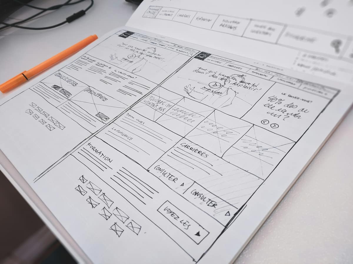
A design token is a named value that stores a single design decision, like a color, spacing step, or font size. Instead of hard-coding #6C5CE7 in fifty places, you reference color-primary. Change the token once and every screen that uses it updates. Tokens are the shared language between your design tool and your code.
Why tokens matter
Tokens solve the oldest problem in design systems: the same value drifting out of sync across tools. When a designer picks a color in Figma and an engineer types a hex code by hand, the two slowly diverge. A token is the single source for that value, so the design file, the CSS, the iOS build, and the Android build all read from the same place. Themes, dark mode, and rebrands stop being find-and-replace marathons.
The three levels of tokens
Most mature systems organize tokens into three tiers. Each tier references the one above it.
| Tier | Also called | Example | Purpose |
|---|---|---|---|
| Global | Primitive, base | purple-500 = #6C5CE7 |
The raw palette of every value the system knows |
| Alias | Semantic | color-primary = purple-500 |
Gives a value meaning and intent |
| Component | Scoped | button-bg = color-primary |
Maps a semantic token to a specific component |
The payoff of this layering shows up at theme time. Switch color-primary from purple to teal, and every component token that points to it follows, without touching a single component.
Common token categories
- Color: backgrounds, text, borders, states, and feedback.
- Typography: font family, size, weight, line height, letter spacing.
- Spacing: a consistent scale for padding, margin, and gaps.
- Radius and border: corner rounding and stroke widths.
- Elevation: shadows and layering.
- Motion: durations and easing curves.
Naming tokens so they scale
Naming is where most token systems quietly fall apart. A few rules keep them legible:
- Name by intent, not appearance.
color-dangersurvives a rebrand;color-reddoes not. - Use a consistent structure, like
category-property-variant-state. - Keep global tokens out of components. Components reference semantic tokens only.
- Avoid baking platform details into names. The same token should work on web and native.
Tokens are the foundation layer of a component library. If that connection is fuzzy, read Design System vs Component Library vs Style Guide.
Frequently asked questions
Are design tokens just variables?
Technically they are variables, but the value is in the discipline around them: a shared naming system, tiers that reference each other, and one source that feeds every platform. The variable is the mechanism; the token is the agreement.
Do I need a tool to manage tokens?
Small systems run fine on native variables in Figma and CSS custom properties. Once you support multiple platforms or themes, a tokens pipeline that exports to each target saves real time.
What is the W3C Design Tokens format?
It is a community standard for describing tokens as structured data, so tools can read and exchange them. Adopting it keeps your tokens portable between design and build tools as both evolve.
Want a token system that survives a rebrand?
I set up token structures that connect Figma to code and hold up across themes and platforms. Take a look at the work to see it in context.
See my workRelated posts
View all

Years of
Experience
Projects
Finished
Unique
Clients Served
Client
Nationalities
Want to see what I can do?
Reading about it is one thing. Take a look at the products, design systems, and interfaces I've actually shipped, then decide if we're a fit.
View my workLike what you see? You'll find how to reach me on the work page and in the menu.