
How to Build a Design System in Figma (Step by Step)
A practical walkthrough from foundations to a published, versioned library your team can actually pull from.
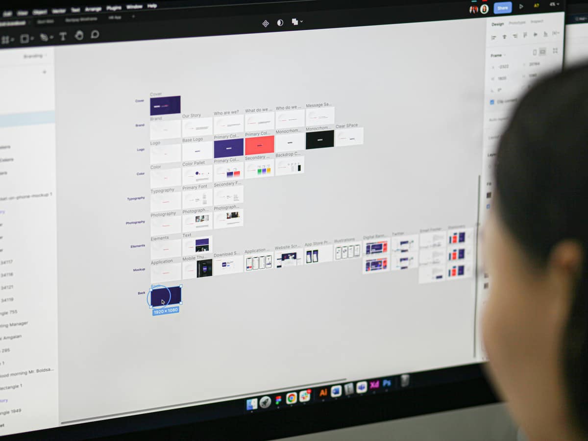
To build a design system in Figma, set up your foundations as variables, build core components with variants and states, document usage, and publish the file as a shared library. The steps below are the order I follow on real projects, designed so you ship something usable early instead of polishing forever.
Before you start, a quick gut check: a design system is worth the effort once more than one person touches the UI and the same components keep getting rebuilt. If that is not you yet, read What Is a Design System? first.
Step 1: Audit what you already have
Open your existing files and inventory every button, input, card, and color in use. You will find five versions of the same thing. List them. This audit tells you what the system actually needs to cover, so you build from reality instead of a wishlist.
Step 2: Set up foundations as variables
Create Figma variables for your core values: a color palette, a type scale, and a spacing scale. Group them into collections, and add semantic aliases like color/primary and color/surface that point to the raw values. This is your token layer inside Figma. If tokens are new to you, see Design Tokens Explained.
Step 3: Build text and color styles
Turn your type scale into text styles and your semantic colors into styles or variable bindings. Now every layer references a named decision, not a loose value. This is the moment consistency stops being a habit and starts being enforced by the file itself.
Step 4: Create core components with variants
Build the handful of components that appear on almost every screen first: button, input, checkbox, card, and your navigation. Use variant properties for type and size, and cover every state, including default, hover, focus, disabled, and error. Wire each component to your variables so a foundation change ripples through automatically.
Step 5: Use auto layout and component properties
Apply auto layout so components resize and reflow with their content. Expose text, boolean, and instance-swap properties so a designer can configure a component from the panel without detaching it. A component that resists customization gets copied and broken; one that flexes gets reused.
Step 6: Document usage inline
Next to each component, add short notes: when to use it, when not to, and any accessibility rules. Keep it brief and keep it in the file. Documentation that lives somewhere else gets out of date the day after you write it.
Step 7: Publish as a library and version it
Publish the file as a Figma library so other files can pull components and styles. When you push updates, write a clear changelog in the publish notes so consumers know what changed and why. Treat each publish like a release, because that is what it is.
Step 8: Set up contribution and review
Decide who can add to the system and how a request gets reviewed. Even a lightweight process beats a free-for-all. Without one, the system drifts back toward the inconsistency you built it to fix.
Common mistakes to avoid
- Building every component before shipping any. Start with the core six.
- Skipping states. A button without a focus state fails accessibility.
- Hard-coding values instead of binding to variables.
- No owner. A system without a maintainer rots.
Want help building or fixing your Figma system?
I build Figma design systems that connect cleanly to code, with variables, variants, and a contribution process your team will keep using. See examples of that work across my portfolio.
See my workRelated posts
View all

Years of
Experience
Projects
Finished
Unique
Clients Served
Client
Nationalities
Want to see what I can do?
Reading about it is one thing. Take a look at the products, design systems, and interfaces I've actually shipped, then decide if we're a fit.
View my workLike what you see? You'll find how to reach me on the work page and in the menu.