
From Figma to Code: Turning a Design System into Components
A practical path for getting a Figma design system into the browser as real, maintainable front-end components.
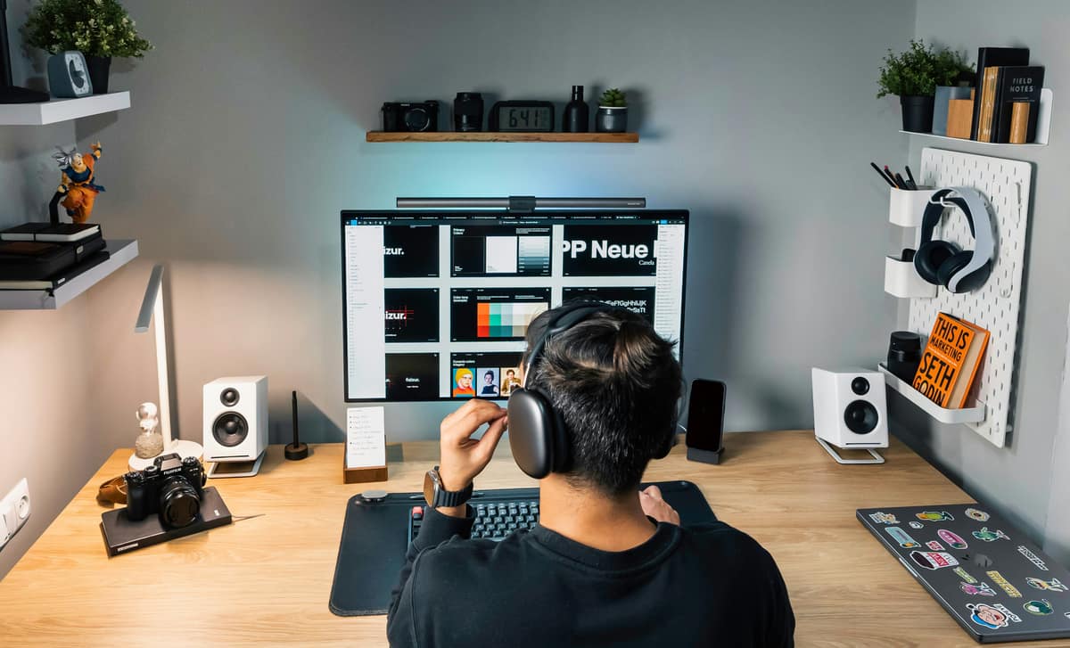
Turning Figma into code means mapping your design foundations to tokens, building each Figma component as a coded one, and keeping the two in sync as both change. Done well, the design file and the codebase describe the same system in two languages. The steps below are the order I follow to keep that translation tight.
This assumes you already have a Figma system with variables and components. If you do not, start with How to Build a Design System in Figma first, then come back.
Step 1: Export foundations as tokens
Pull your Figma variables, color, type, spacing, radius, into a structured token set. This becomes the shared source both sides read from. Keep the naming identical to the design file so a conversation about color-primary means the same thing to the designer and the developer. See Design Tokens Explained for how to structure them.
Step 2: Turn tokens into CSS variables
Land those tokens in the browser as CSS custom properties on :root. Now every coded component reads the same values the design file uses, and theming becomes a matter of swapping variables rather than editing components. The mechanics are covered in CSS Variables.
Step 3: Match the component API to the Figma variants
Each Figma component has variant properties: type, size, state. Mirror those as props in code. A button with variant and size properties in Figma becomes a button component with variant and size props. When the two APIs match, designers and developers describe the same component the same way, and handoff stops being translation.
Step 4: Build for every state
Figma should already define default, hover, focus, disabled, and error. Implement all of them, and treat the focus state as non-negotiable, because it is the keyboard user's only cue. A component that looks right but skips its states is not done.
Step 5: Build primitives before pages
Code the small, reusable pieces first: button, input, card, then compose them into larger patterns. This mirrors how the design system is structured and keeps the codebase as composable as the Figma library. Pages assembled from solid primitives stay consistent for free.
Step 6: Document and version the coded library
Give the coded components the same treatment the Figma library gets: usage notes, prop documentation, and a versioned release with a changelog. A tool like Storybook lets designers and developers see the live components in one place, which is the fastest way to catch drift between design and build.
Step 7: Keep design and code in sync
The hard part is not the first build, it is the second month. Agree on which side is the source of truth for a given change, and route updates through the token layer so a foundation change flows to both. Without that discipline, the file and the codebase quietly diverge until nobody trusts either.
Why a designer who codes shortens this
Every step here is a place where meaning gets lost between two people. When the same person designs the system and implements it, most of that loss disappears. The component API matches the variants because one mind shaped both. That is the gap I work in, and it is usually where the time savings hide.
Want your Figma system shipped as real components?
I take design systems from Figma into production front-end, with tokens, matched component APIs, and a sync process that holds. See how it comes together across my projects.
See my workRelated posts
View all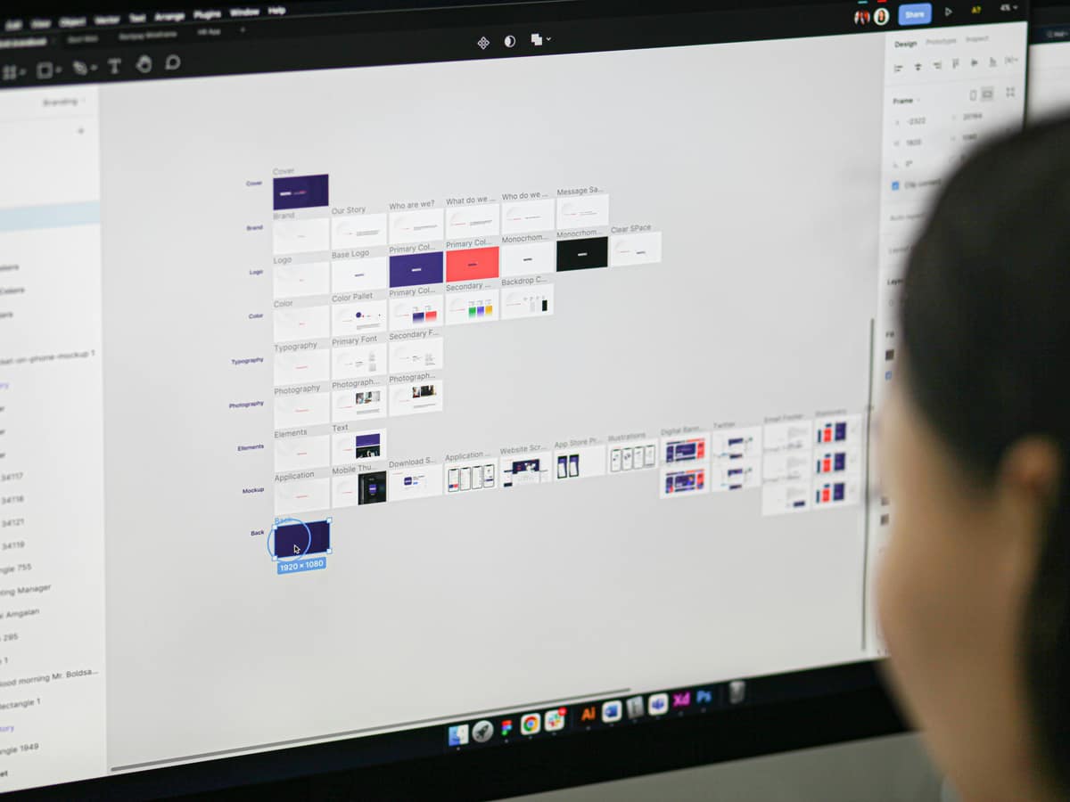

Years of
Experience
Projects
Finished
Unique
Clients Served
Client
Nationalities
Want to see what I can do?
Reading about it is one thing. Take a look at the products, design systems, and interfaces I've actually shipped, then decide if we're a fit.
View my workLike what you see? You'll find how to reach me on the work page and in the menu.